The Gawker Redesign, Reviewed
It’s been in the works for a while now, but it looks like the Gawker media blogs have finally released the new design in the wild, across the entire blog network.
The reaction so far is predictable. And hilarious (hilariously NSFW.)
Lifehacker posted Nick Denton’s manifesto on the new design last November, and previews were floating around at that time. Denton talked a lot about traffic statistics, branding and advertising, but also more specifically about the design and UX. The design goal was to evolve beyond the traditional blog: to feature content outside of the usual timeline, to aggregate and classify the content more effectively, to showcase more than just text-based content, and to use visual content is a more arresting fashion.
It’s hard to understand why this demands a manifesto, because there isn’t much that is conceptually new here. Traditional media have already expanded beyond the basic blog feed, with front page feature areas, modules, that display different slices of information, slideshow templates, and video showcases.
What is new is The Box. It’s not necessarily new to the web, but it’s probably new to blogging, and it’s certainly new and shiny to the exclusion of almost every other detail of the new design.
The pages still scroll, but the top and bottom navigation bars and the side borders create the impression that you are in an App, and not on a traditional site. Content loads via AJAX without a perceptible reload as well. The viewport scrollbar only works on the main story, leaving the right content list and navigation in place.
It’s clear that the design is meant to shift the control of the browsing experience from the user to the editor. The top and bottom buttons point to the next story, or to different slices of the content lists, or allow the user to scroll to the next batch in the list. In fact, there is no visible way to scroll the list of stories on the right, aside from the button. The mouse-wheel or trackpad scrolling does work when hovering over the list, but it’s frustratingly inaccurate.
The most puzzling thing about The Box is the fixed width, however. It makes the whole model seem simultaneously claustrophobic and antiquated. It’s as if the design wants to take over the whole viewport, but isn’t confident enough to stake out the entire width, so it apologetically hems itself into the middle of the window.
The Box is about as interesting as it gets, though. The visual design is flat and somehow drab. The logos are drab, and the buttons are grey and lifeless, too full of text to be immediately decipherable. The color palette seems to be limited to mostly greys, with a single complementary color for the links per blog. The typography is even less considered. There is little variation in type size and little attempt to anchor and arrange type in any way aside from left and right justification.
The body copy, byline, comment metadata, and comments are all basically the same. It’s as if it were laid out using Netscape Navigator 2. Even a minimalist can understand using font sizes to create a sense of hierarchy.
And here we are, making the visual elements more arresting:
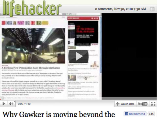
A video is sandwiched between the top bar and the page headline, offset by a somewhat drab logo. Some space might help here, or perhaps a larger video size, or even a better poster frame for the video.
And then there is this:
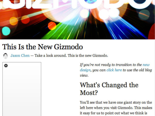
Most of Denton’s manifesto revolved around advertising, and the site does not even accommodate a standard banner unit in any meaningful way. (The ad in question is the grey box in the lower left, a skyscraper obscured by the brilliant ClickToFlash.)
It’s as if the actual content of the site was not considered, at all. Even the ads, which seems out of character.
The strange part about this is that the Gawker network had already developed strategies to keep featured content visible and some nice visual designs. The top row of stories with large thumbnails from the prior design, as seen now on The Awl, were much more compelling than the new right hand list. Each blog had its own character, whereas now they are all uniformly, blandly, part of the same network. The new design fails at almost every visual goal set in the manifesto.
It will be interesting to see how The Box inevitably evolves in the next few months.