Squaring up with CSS Grid
Like all web designers, I’ve been curious about the CSS Grid specification and its potential to change the way we create websites. I’ve finally had a chance to try using CSS Grid in a project and thought it would be fun to share my work.
(This is not a tutorial or explainer for CSS Grid. There are much better resources on the web currently, including the Grid by Example, and the Complete Guide to Grid.)
CSS Grid lets you define two-dimensional layout rules for web pages and easily place elements in the grid layout. You can specify a starting row or column for each element or class, set the number of columns or rows it fills, and the layout engine then neatly flows everything into the grid container.
There is a catch with CSS Grid: the specification for subgrid is not currently supported. Subgrid allows child elements of a grid container to adopt the parent grid rules for its own child elements. The lack of subgrid means that child elements can be placed in the grid, but they aren’t aware of the rules or dimensions of the grid area they inhabit.
Also, as I understand it, child elements placed in grids can’t overlap or wrap around siblings, like floated elements. Similarly, masonry-style layouts do not work, as placed elements are contained by the boundaries of the rows and columns.
Altogether, this means that you need to be strategic about where to deploy grid in the document tree, or use other CSS techniques to apply the grid dimensions to nested elements.
All that aside—CSS Grid layout is pretty great! In supported browsers, it mostly Just Works, without the needs to clear floats, manage whitespace as with inline-block, or worry about flexbox content that may or may not be possessed by a poltergeist.
These examples look at using CSS Grid to align a set of typical article page elements in a modular, responsive layout. (You’ll need a browser that supports CSS Grid, such as Chrome with the Experimental Web Platform features flag enabled, Firefox Developer Edition, or Safari Technology Preview.)
Sample Article Page | Sample Style Demo
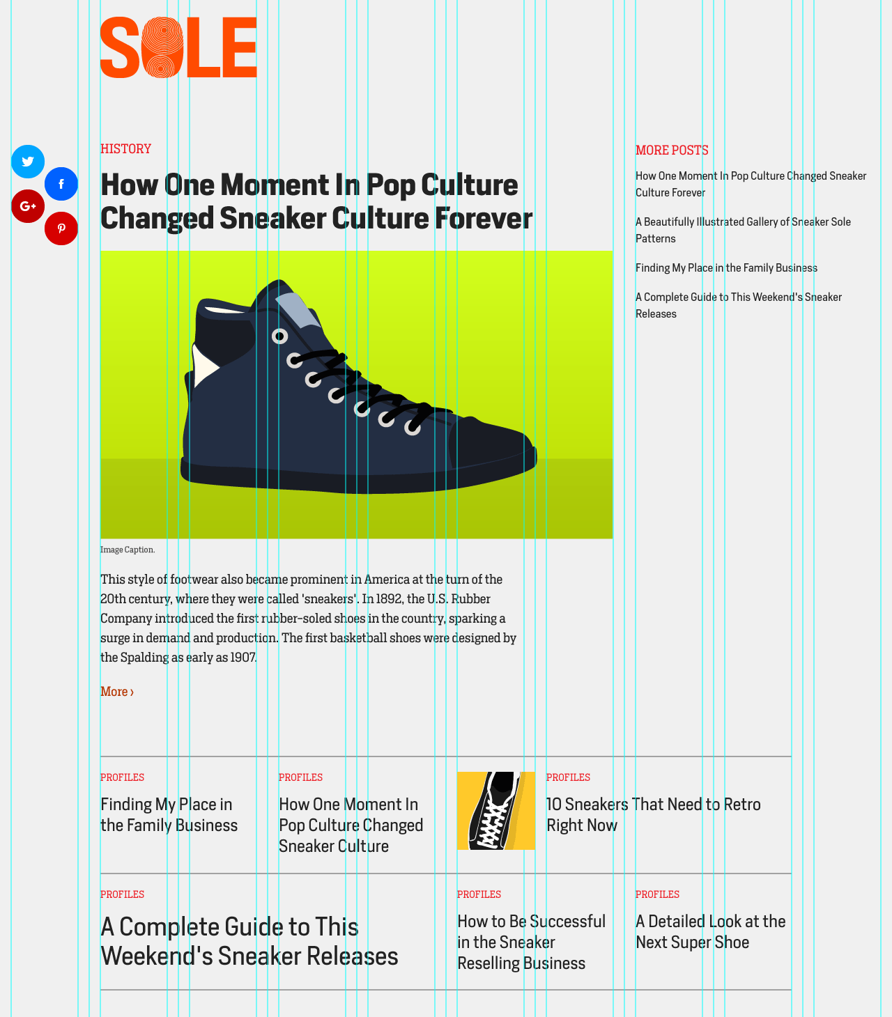
Content flows horizontally into the grid. Content is not in column silos, but rather in modules that fill each row. This can allow tighter placement of article content and supplementary asides.
The Grid has multiple states. I first define the Grid at min-width: 45rem with 6 columns, then 8 columns at 60rem, and 10 column at 75rem.
The pages use multiple Grids. The primary Grid is attached to the <article> element, the parent of the main content modules. However, a grid is also attached to the header element, using the same specs, so that the header elements can have the same dimensions and layout as the article.
Gutters are not defined by grid-column-gap. Instead, the modules have a 1rem left and right margin, which effectively creates a 2rem column gap in between. I can’t remember exactly why, but early on this seemed to me to help with managing margins in a way that I could control.
Flexbox takes the place of subgrid in the color swatches and the bottom archive grid. Since I know the number of columns that the modules span, I can use flex-basis and flex-wrap to have modules adopt grid column widths. Gutters are created using the same margins that the parent modules use. Also, CSS Columns are used in one text module, with a similar gutter strategy.
Floats can also simulate grid columns. The floated image uses calc to define a width based on column span percentage.
SVGs can create problems. I had some trouble with the SVG images in Firefox—the Grid rows would not automatically adopt the current height for the SVG images, causing them to hang over into the next row. This was solved by adding a width and height to the SVG tag. There is a similar problem in Firefox with the color swatches, which use padding to define the height. I haven’t figured out a solution here yet.
Any feedback? Let me know. I’ve very interested in seeing how Grid can give us more flexibility in constructing pages. Next steps: figuring out how to use @supports to integrate Grid into projects that also support current browsers.