Duolingo Redesigns for iOS 7
In writing about iOS 7 last week, I thought that while the overall visual design of the system was poorly executed, a possible upside could be that the new look provided a clean slate for developers to build on, beating Apple at its own game.
Duolingo has done just that in a redesign of their free language learning app.
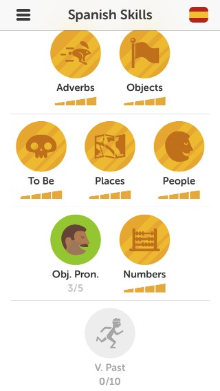
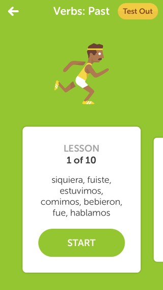
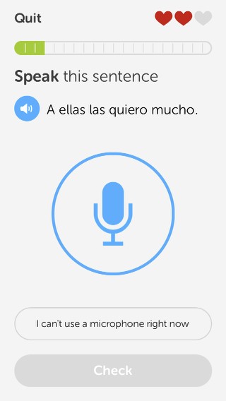
The redesign is a take on the flat design philosophy utilized throughout iOS 7—glossy icons become simpler shapes, dimensional toolbars are now simple grey rectangles, and buttons are transformed in flat fields of color with rounded corners.


Where Duolingo succeeds is by avoiding avoiding the minimalist trap that is the main flaw with many of Apple’s new designs.
Instead of a monotone palette of greys, bright colors and shape textures make buttons and controls more lively. The app uses the Museo Sans typeface instead to the various flavors of Helvetica to give the interface an approachable, contemporary look. Icons go beyond simple geometric shapes, using a more illustrative approach to bring wit and flair to each lesson.
The redesign also makes good use of the new zooming animations in iOS as one navigates from section to lessons to individual exercises.


The combination of bright colors and simple shapes can bring a childish tone to a design, and that is somewhat true here, but it’s not unsuitable for a language app, especially given Duolingo’s gamified approach to learning.
Apple’s new app designs are a disappointment because they take a slavish approach to minimalism; Duolingo succeeds because they use flat design as inspiration rather than rulebook. The result is a fresh look and feel that can engage users and encourage them through the hard work of learning a new language.