Notes on the 2013 Redesign of An Event Apart
When Jeffrey Zeldman approached Tim and I about working on the redesign of An Event Apart, we were happy to take the opportunity.
There are obvious benefits to working on such a highly visible and prestigious conference website, along with the knowledge that our best design ideas and work would be welcomed. On the other hand, there are challenges to working on such a visible property, and we expected that the work will face both constructive and deconstructive criticism. At this point, we are all very happy with the resulting site, and even though there remain areas for improvement, we think that visitors will also find it an engaging and user-friendly experience.
The basic strategy behind the redesign was to modernize the site—the old pages were boxy, with small type, and the content had spread organically around different pages and sections. The Events page, for example, was largely a carbon copy of the home page, but included a mix of marketing content that was working at a cross-purpose. The Home page had a limit on the number of upcoming events that could be displayed, and the scrolling mechanism for revealing more was not immediately apparent. The templates enforced a narrow 3 column vertical grid on almost every page, forcing the content into a narrow silo in the middle of the page, and creating a sense of sameness across the site and a sort of column blindness on the right and left edges. Profile pages felt bare and unsubstantial, and the News templates were flat and uninviting. Along with providing a fresh appearance, we also felt that a redesign could reduce the tediousness of many production chores.
We decided we wanted the new site to appear as a continuation of the AEA brand, which meant retaining some of the visual character of the old site. The initial building blocks included the off-white color scheme and the general warm tone. We decided to proceed with the same logo, of which there were two versions—the lockup used on the original site, with type arranged vertically over a large round laurel wreath, and a horizontal lockup with type on a single line over a smaller wreath.

We also liked Joshua Darden’s typeface Freight Sans, which had been used over the hero images in the original site; since the typeface was available for licensing as a web font, we decided to use it more extensively throughout the new site. Later on, we also added Vernon Adams’ web font Pacifico to provide some retro contrast to Freight Sans.
The basis for the vertical page grids is an eight column, 960 pixel grid created from a base unit of 12 pixels. The base unit is used for defining margins, padding, line-heights, and so forth. Grid columns are fixed width rather than flexible or liquid, which gave us some consistency at the expense of some aspects of responsiveness in the layout.
Our strategy from the beginning was to try and shake up the vertical grids to create more energy on each page, and so we tried to move away from a single grid across the templates. To this end, we have arranged the content into modular chunks which exploit the grid in different ways. Much of the marketing related content uses a single wide column for impact, while the more informational content is arranged into sets of columns.
By using a mixture of grids, we hoped to shake off the column blindness that affected the former site design. For example, the sponsor logos and testimonials have more impact and room to breathe as full width modules in the page flow. Conversely, the News archive page is more interesting as a matrix of articles, rather than the usual scrolling full-width list.
Across the site, the grid combinations in use are a single column, an even two column split, an even four column matrix, and an asymmetrical three column grid with a very narrow left column used mostly for overhanging images and article metadata.
The decision to keep the then-current AEA logo had a large impact on the grid and the initial design concepts. The larger, round logo required a placement similar to the older design, where it lived in a vertical column. We removed the cigar-wrapper box surrounding the logo and made it a larger so that it implicitly defined a left column. This conflicted with our grid strategy, and so the horizontal logo became our de-facto choice early on as it allowed us to create a header with navigation across the top of the pages, freeing up the rest of the page to allow for full width text and images.
As we worked through the designs, we realized that the modern feel of Freight Sans and the bolder approach to photos and content did not fit well with the more delicate sensibility of the older logo. The serif letterforms and more detailed laurel leaves had a classical, literary tone which fit well with the A List Apart and A Book Apart brands, but felt out of place in the new An Event Apart design concepts.
We then experimented with a logo combinations using Freight Sans and the original laurel wreaths, as well as a version with the A Book Apart laurel roundel. These were better, in that the weight and feel of the type fit the direction of the site, but the stakeholders thought that there was confusion between the brands with the combination of symbols and so we decided to design a new mark to accompany the type.

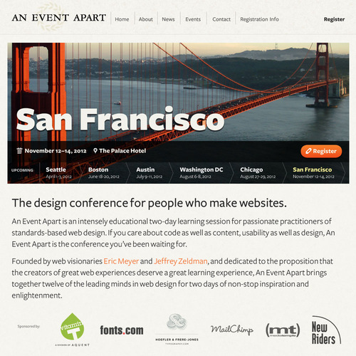
The new mark simplifies the laurel leaves of the older wreath, smoothing them into simpler, more modern shapes. The leaves curl away outward from the baseline of the leading A of the logotype to suggest the round shape of the full wreath. The mark has enough strength on its own to be used in or out of lockup with the logotype, and so we decided to use it in a variety of ways around the site. On the full width site, the mark appears with the city names to add the branding to the location. On the tablet and mobile views, the mark again pairs with the type as the full logotype. The mark also appear as a flourish at the top of some pages, and reversed in the footer.
The old AEA home page used a set of 5 boxes to display upcoming events on the home page—one large hero image at the top and 4 boxes below. An arrow appears to allow the user to scroll the 4 smaller images to the side and see events farther in the future.
We decided to replace the boxy hero images with a carousel that allowed us to place more prominence on a single event, but also feature more events within immediate view. One of the business goals was to have a system which could showcase anywhere from 4-16 upcoming events.
Our first strategy was to use a main hero image in the carousel and display the other events as text links. In this way, the user could quickly scan the set of upcoming events. Clicking an upcoming event, large or small, would take the user to that event page, rather than control the carousel. The large carousel would rotate automatically through the set of events. Large images used in the carousel would also be used on individual event pages. All copy in the carousel would be set using web fonts, which would cut down on production time for the images. Early on in the carousel design we thought about adding a map overlay to the carousel as a visual device, but this seemed limited in scale—for example, for possible future expansion outside the US—and also difficult to maintain in the CMS.

For art direction, we wanted to move away from displaying mostly city skylines, and try to focus on local character in each city, as far as that was possible. As we moved through design concepts, it became apparent that setting web type directly over a diverse selection of photographs would be difficult to automate; it would also prove difficult to settle on a set of photographs that had consistent detail and tone. This led us to the tinted images in the final design, inspired by the feel of vintage travel photos and posters. The text links evolved into small cards, extending the metaphor, and we settled on arranging them at the bottom in a pseudo 3-dimensional cover-flow style. When we later made the site responsive, this gave us the opportunity for more interesting effects. The final piece of design on the carousel was to add an extra grid column of width to each side of the large images, in order to span the window on smaller viewports—again breaking our grid in a small but interesting way.
There is some debate over the effectiveness of a carousel as a homepage device, with regards to lost messaging when users see the carousel as a banner ad or do not wait or interact to see messaging hidden later in the carousel. This problem seems mitigated in our case, where we are presenting a very like set of items—city names—to choose from, and including text labels on the slides. This is also why we decided to have direct click-through to events rather than use the slides to control the carousel. In fact, the AEA carousel is more akin to a carousel with a list alongside, as there is no real interaction between the large slides and the list of cities.
As we picked apart the content that made up the old site, we made many decisions about restructuring pages. On many pages, content had organically grown and expanded to include new messaging. We needed to rearrange the content to give the pages a proper hierarchy, creating more compact and readable chunks of information. This also supported our desire to break apart the old grid, moving repetitive content out of columns where we felt it was unseen by users.
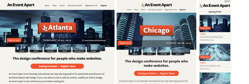
For example, on an old Event page, the top of the main column was a headline and a paragraph of marketing copy in relatively small type. In the left column, in lighter grey, are two messages in italics; a piece of copy summarizing the event, and then a reminder about the running time of each show. Sponsors are tucked down low on in the left column.
In a new Event page, the top of the page makes use of the full width of the grid. At the top is information for people who are considering going—a description of the event, a call to action to register, a summary of speakers, three blocks of need-to-know details, and the grouping of sponsors. The message about event timing is moved down to be included with the event calendar, lower down on the page. The calendar listing is also expanded to fill the page width, but uses grid columns to arrange each calendar entry.
The basic UX for the individual Event pages stayed the same, aside from rearranging content. The Events listing page was a different story. In the old design, the Events page duplicated the upcoming events display from the home page, completed with difficult scroll mechanism. Below some marketing copy, it sandwiched a listing of old events between a column with more marketing copy and a narrow column of testimonials and sponsors.
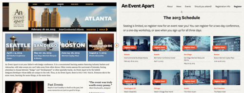
In the new design, the page focuses solely on a matrix list of upcoming events, arranged to accommodate as many as necessary. The page can serve double duty as both a definitive list of events and store gateway for purchasing tickets. The marketing copy is moved to the About page, and a new page we created, Should You Attend, focuses on the diverse group of professionals that might benefit from the conference.
The News and Profile pages received a lot of attention in the new design, using a 3 column grid with a narrow left column for metadata and links. Videos and photos are much larger in News posts, and images are mandated for inclusion with each post, giving the News templates much more visual impact.
One unique aspect of the prior AEA art direction was the use of “action” shots for the speakers—that is, shots of the speakers on stage, speaking, as opposed to the head shots that most conferences use. We decided to keep this strategy but evolve it somewhat. The old speaker photos cropped in to the face, which made for some unevenness of lighting and color. The new photos crop to some of the body and arms as well, mitigating the unevenness of tone and enhancing the sense of action. We also chose to use head shots on the profile pages for contrast, associating action shots with the sessions and centering the profiles more on the personalities. We tried to make these more candid than the standard corporate head shot, where possible.
A small UX change on Event pages was the switch to a static Google map from the former interactive, embedded map. These maps were used to show the venue location at the bottom of pages, but had the annoying habit of stealing mouse or finger focus if you moused over or tapped them. The static maps are smaller and tighter, but do not change the usability significantly, since map functionality like directions and so forth always meant clicking through to another page.
The footer also contains a small but satisfying piece of design in the right-most column—the type and photo credits for each page. These are put into data attributes by the CMS and then assembled by JavaScript on page load. This allows us to create a sort of colophon for every page and even allows credits for photos served by Vimeo as the video poster frames.
We approached the design for this project using our usual process, which involves creating Photoshop comps and then building out templates in HTML. The client and profile of the project meant that a responsive layout was going to be a key feature of the site, and so we kept that in mind from the beginning, structuring the page layouts so that we would be able to follow standard responsive methods for rearranging content as the viewport narrowed. Similarly, we prefer a fixed width grid for large viewports, but also realized that we need to switch to a liquid layout below a certain breakpoint to accommodate a wider variety of screen sizes and devices.
The responsive layouts were created after the HTML templates were first built, but the breakpoints also fed back questions which helped finalize certain aspects of the design. The cover-flow effect in the carousel is one example of this, when it was decided that some sort of responsive scrolling was need to accommodate a flexible number of events. The event layout from the Event page became much more prominent as we worked out the small screen views, where we realized that a tighter, lower-bandwidth view would be faster and more flexible than a small-viewport version of the carousel.
A huge thank-you goes out to many photographers who, via Creative Commons licensing or direct contact, allowed us to use the excellent photos on the site, including John Morrison, Marc Thiele, Peter Hart, and Jim Heid, amongst others. We’ve tried to be as comprehensive as possible with crediting photos, but if there is an oversight, please let us know.
We’re very happy with the site after all this work—work made longer by the knowledge that our peers would be holding it up against the high standards that the conference both promotes and upholds. Parts of the site remain unfinished as of yet—the store was not part of the initial scope, for example, being a separate site, and we have not yet implemented an approach for higher resolution images, a shortcoming that can be painfully obvious (to us at least) on some mobile screens. We’ll be addressing these items shortly, based on the solid foundation we have built thus far. Absolute perfection in web design is simply unattainable, but I think I can count the number of little details that I just want to shift by a few pixels on one hand— and that to me is a roaring success.